
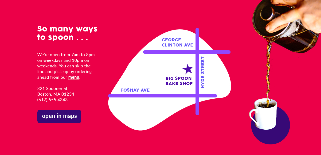
Big Spoon Bake Shop
When my grandpa was younger he worked at the family bakery, and has always encouraged me to start my own. In lieu of completely changing career paths, I decided to imagine what at website would look like if I did start my own bakery. I knew I wanted it to be fun while avoiding any nonsense in navigation. Although baking is still a frequent hobby, I think I'll stick to design for now.

The Challenge
Dividing the website into five sections, I started by choosing the color palette. I then adjusted each color to meet standards of contrast for accessibility reading. Since baking is an art done by hand, I chose to connect the sections by similar pictures of arms. To highlight this element, I also added a simple circle (representative of cookies, donuts, etc.) in the accent color. There is balance in the website through its symmetry, but I keep it exciting by adding hidden micro-interactions with various elements. In the end I asked myself, "why would a customer come to this website?" and tried to eliminate any excess while remaining intriguing.


Creating the menu was the most challenging. I knew the landing page had to include the menu because most customers visiting the site would be coming specifically to order food online. In order to fit the whole menu I included links to various pages at at the top. I also added a spot to highlight how many items are in your cart. To add an item a customer would click the plus sign and the quantity would update. This is intuitive and skips a constant back and forth checking of what's in the cart.